

You've got 20 tabs open. Half are "best gym websites" listicles showing beautiful photography with zero explanation of why any of it works. The other half are Squarespace, Wix, and Webflow pricing pages.
Meanwhile, your own site is probably leaking trials right now—a broken booking flow, a PDF schedule buried on page three, or a stock photo hero that could belong to any gym in any city. You suspect it, but you can't prove it, and you don't know where to start fixing it.
This post is different.
You'll get 17 real fitness website examples grouped by gym type—each with a breakdown of what works and what to steal. You'll also get a 7-point conversion checklist to score your own site against, and an honest breakdown of when to DIY vs buy an all-in-one.
Every site in this list earns its place by converting visitors into trial bookings—not by looking good.
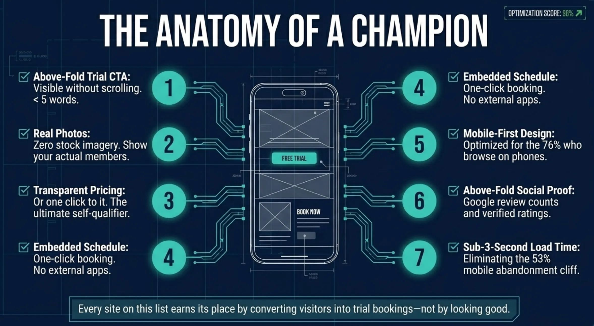
TL;DR—The 7 Things Every Converting Gym & Fitness Website Has
What Converts on a Gym & Fitness Website (and How to Measure It)
Good-looking sites don't always convert. The difference isn't design taste—it's how clearly and quickly your site answers a visitor's three real questions: "Is this place for me?" "What does it cost?" "How do I try it?"
Each of the seven elements below includes a measurable signal so you can verify it's working, not just assume it is.
Above-fold trial CTA
The above-fold CTA is the single most important element on your homepage. "Above the fold" means visible without scrolling—on a phone, roughly the top 600–700 pixels.
Four or five words maximum, action-driven.
"Book a Free Trial Class" beats "Learn More." Pull up your homepage on your actual phone right now. Can you hit the booking button with your thumb without moving your hand? That's the test.
What to track: CTA click-through rate (GA4 event). Scroll depth before the first click. If most clicks happen before the 50% scroll mark, you're in the right place.
Real photos of your space and members
Stock photos are the single biggest trust killer on a gym site. Visitors spot them instantly—and when they do, the signal is: this gym doesn't have anything real to show me.
Real photos prove the space exists and that people actually show up. And they show what the energy of a class feels like—the real decision driver for anyone on the fence about starting.
A Saturday morning of phone-camera shots with consented members beats a $500 stock library every time.
What to track: Time-on-page on your about or gallery pages. Scroll depth past the hero image.
Transparent pricing (or a clear path to it)
"Contact us for pricing" is the fastest way to lose a trial-stage prospect. Most people at that stage are researching quietly, from their couch, at 10 PM. Forcing a phone call filters out everyone who doesn't want to be sold to—that's most of your best prospects.
A "starting at $X/month" anchor or a clear rate card gives visitors the confidence to keep reading.
You can still have a qualification conversation when they call. The prospect who won't call is usually your most qualified one. Give them a number and they'll self-qualify.
What to track: Pricing page → trial CTA click rate. High bounce from the pricing page usually means friction, not sticker shock.
Embedded class schedule with one-click booking
This is where most gym websites lose the conversion. A visitor wants to try a class. They click "Schedule." What happens next determines whether they book or bail.
PDF download—gone. New tab to Mindbody requiring account creation—gone. Embedded, live, mobile-friendly schedule with two-tap booking on the same page—conversion.
Sites with embedded scheduling consistently outperform those that link out—trial booking completion rates improve substantially when visitors never have to leave the page.
Every external link is a context switch. Every context switch is a reason to close the tab.
You can embed a booking widget on your existing site—including WordPress—without rebuilding anything.
Alina at OB Jiu-Jitsu Collective found Gymdesk exactly this way:
"I was actually just looking online for best gym softwares for jiu-jitsu communities and this one was made for jiu-jitsu which really sold me because it was like everything was integrated on what you needed."
For Alina, that integration meant one less tool to manage—including the site itself.
What to track: Schedule page view → booking confirmation rate. Under 5% means your booking flow has friction worth fixing.
Mobile-first design
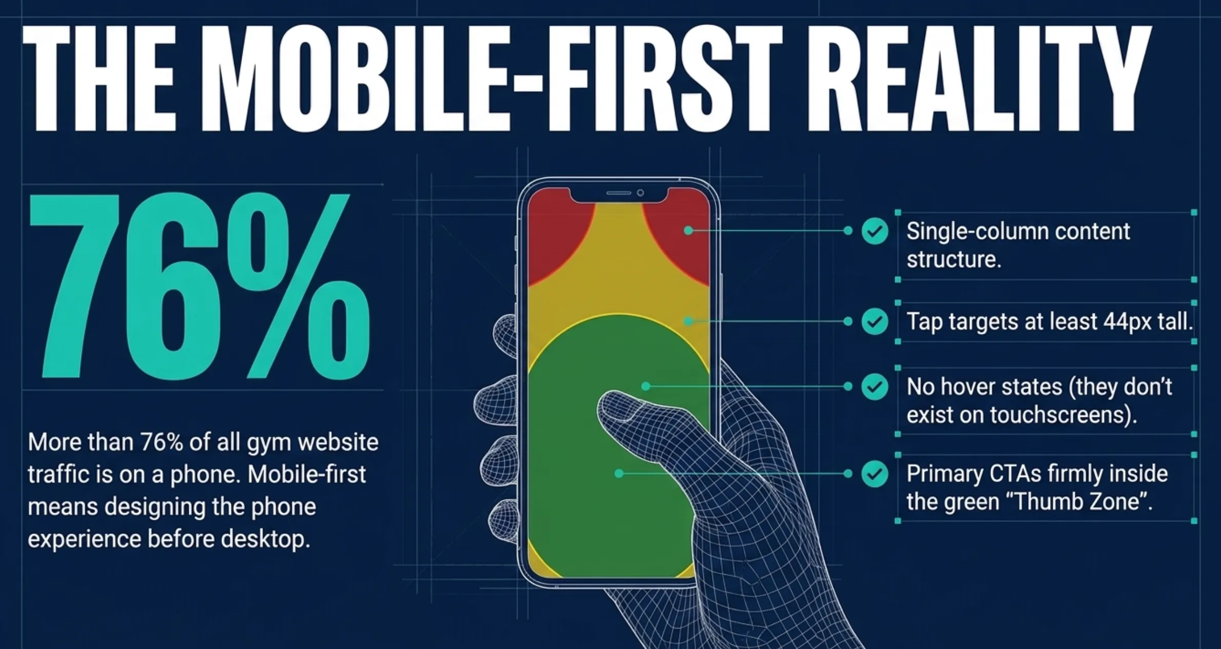
More than 76% of all website traffic is now mobile. And 53% of mobile users abandon a site that takes more than three seconds to load.
Mobile-first means designing the phone experience first, then adapting to desktop—not the other way around. Single-column content. Tap targets at least 44px tall. No hover states. CTAs in the thumb zone.
88% of consumers research a local business online before visiting in person—most of that research happens on a phone.
What to track: GA4 device-segmented bounce rate. If your mobile bounce rate is significantly higher than desktop, you have a mobile problem.
Social proof above the fold
People trust other people more than they trust brands.
Your Google review count needs to be visible before anyone scrolls. Everything else—a testimonial, a member count, a star badge—amplifies it.
Specificity is everything. "Great gym" is noise. "I came in with no experience and was sparring by month two" is proof.
Anonymous testimonials read like marketing copy because that's what they are.
What to track: Scroll depth past the social proof block. Hero-to-CTA conversion rate before and after adding social proof above the fold.
Sub-three-second load time
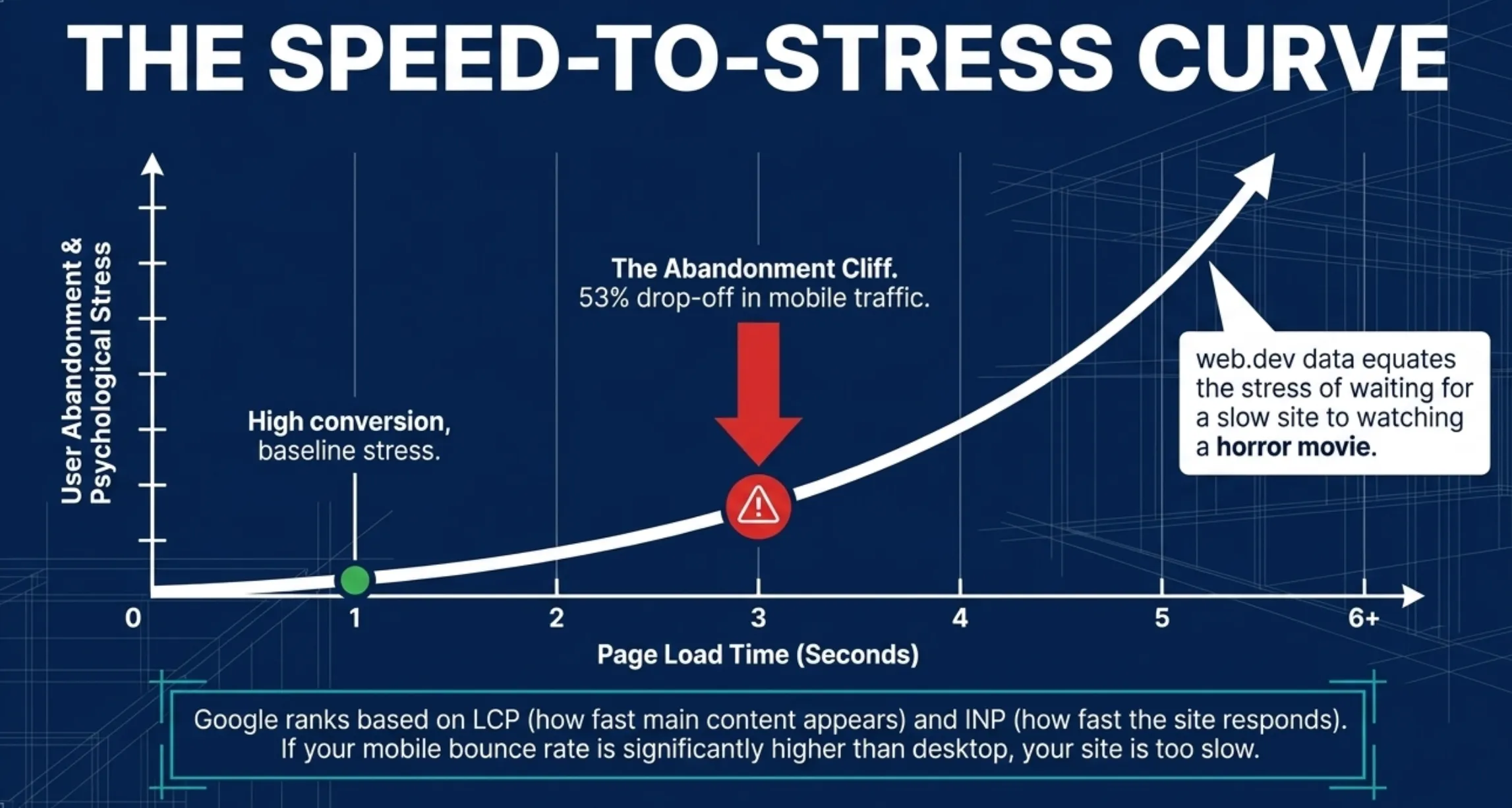
Google confirmed Core Web Vitals as ranking signals in 2021 (updated in 2024 when INP replaced FID)—they remain so in 2026. Pages that load in one second convert at three times the rate of pages that load in five seconds.
LCP is the one to fix first—that's how fast your main content appears. INP and CLS measure responsiveness and layout stability. Check all three free at PageSpeed Insights.
What to track: PageSpeed Insights score on mobile. GA4 page load time segmented by device.
17 Gym & Fitness Websites Worth Stealing From
Score each site against the 7-point checklist as you scroll. By the time you reach number 17, your own site's gaps will be obvious.
Martial arts schools (seven examples)
Martial arts schools face a specific conversion challenge: your visitor is probably intimidated.
The best martial arts sites lead with accessibility—real people, beginner-friendly language, and a trial that feels low-risk.
1. Two Bridges Muay Thai—New York, NY
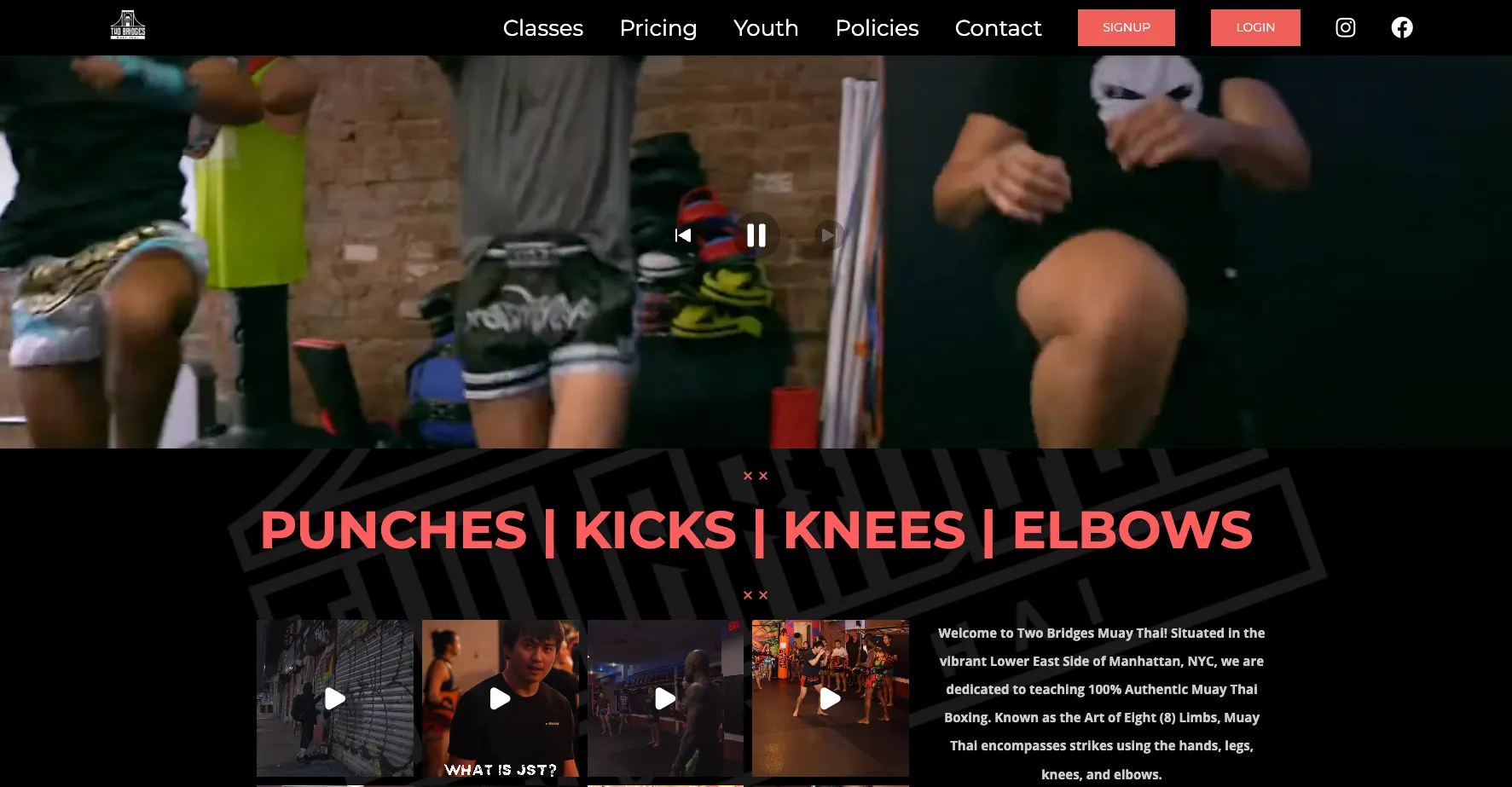
What works: A full-bleed video hero of real fighters drilling punches, kicks, knees, and elbows—no text overlay, no stock fitness imagery. "PUNCHES | KICKS | KNEES | ELBOWS" in big red display type below the fold, paired with "100% Authentic Muay Thai" copy.
The site assumes the visitor is already curious about Muay Thai and proves the gym is the real deal in three seconds.
A persistent red SIGNUP button sits top-right on every page. Classes, Pricing, Youth, Policies, and Contact are all one click from the nav—no hunting.
What to steal: Lead with footage of what actually happens in your space, not a slogan. If your gym has a distinctive look in motion—mat rolling, bag work, a barbell session—a six-second video clip of it converts harder than any photo. Co-owners Dillan Joucoo and Justin trust the work to do the selling.
2. OB Jiu-Jitsu Collective—Ocean Beach, San Diego, CA
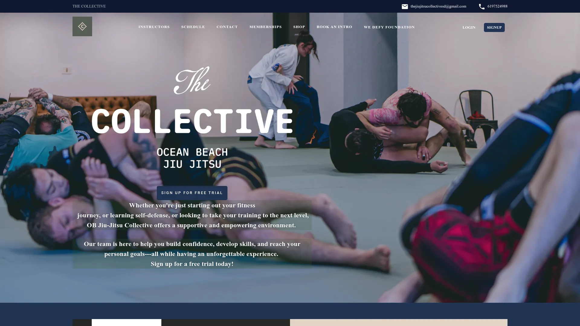
What works: The site carries the gym's beach-adjacent personality immediately—nothing corporate, nothing uptight.
A QR code at the gym links to the Gymdesk-built site, so a member who discovers the gym in person can self-signup online the same day—no handoff, no gap. Alina didn't have to build the site independently—the platform handled it.
What to steal: Community-forward positioning. The site leads with who trains here and what they're building together—not a list of programs. For a new gym, community is the differentiator.
"What we're trying to bring to this community is high-level jiu-jitsu with more of a laid-back vibe. We wanted to feel authentic to Ocean Beach and not be like uptight."
— Alina, OB Jiu-Jitsu Collective
3. Triple Seven Jiu-Jitsu—Ventura County, CA
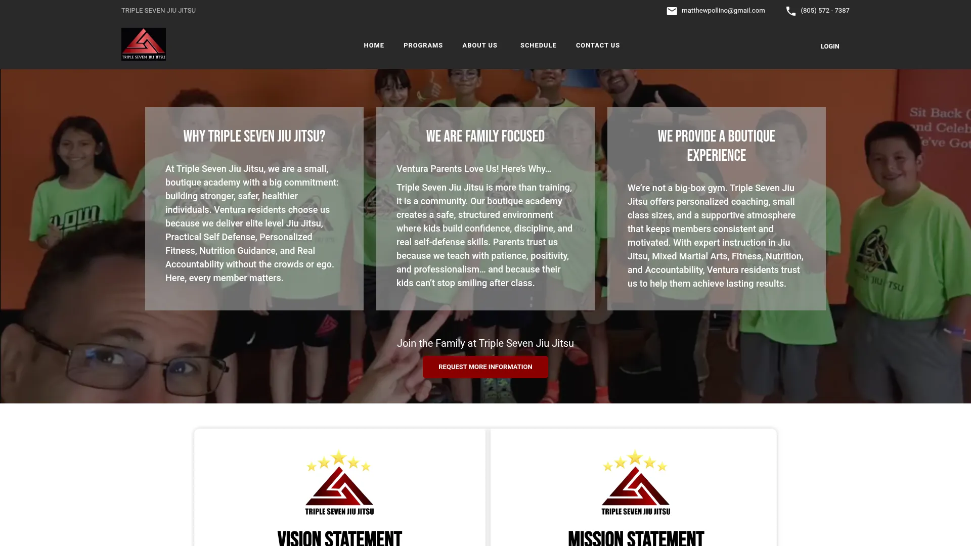
What works: Hundreds of Google reviews at a near-perfect rating are prominently displayed—serious social proof surfaced before a visitor scrolls.
The gym tagline ("Self-defense is a gamble. Make sure the odds are in your favor.") is specific, memorable, and tied directly to the gym name.
What to steal: Your Google review count and rating deserve a prominent spot on your homepage, not buried on a contact page. Matthew Pollino's Triple 7 puts the review count front and center.
For Matthew, "staying out ahead of it" starts online. Hundreds of Google reviews at a near-perfect rating are part of how Triple 7 keeps the machine running.
"When you first opened, I just want to teach jiu-jitsu... But then when the machine is up and running, like Pac-Man, you got to stay out ahead of it."
— Matthew Pollino, Triple Seven Jiu-Jitsu
4. Adayama BJJ—San Diego, CA
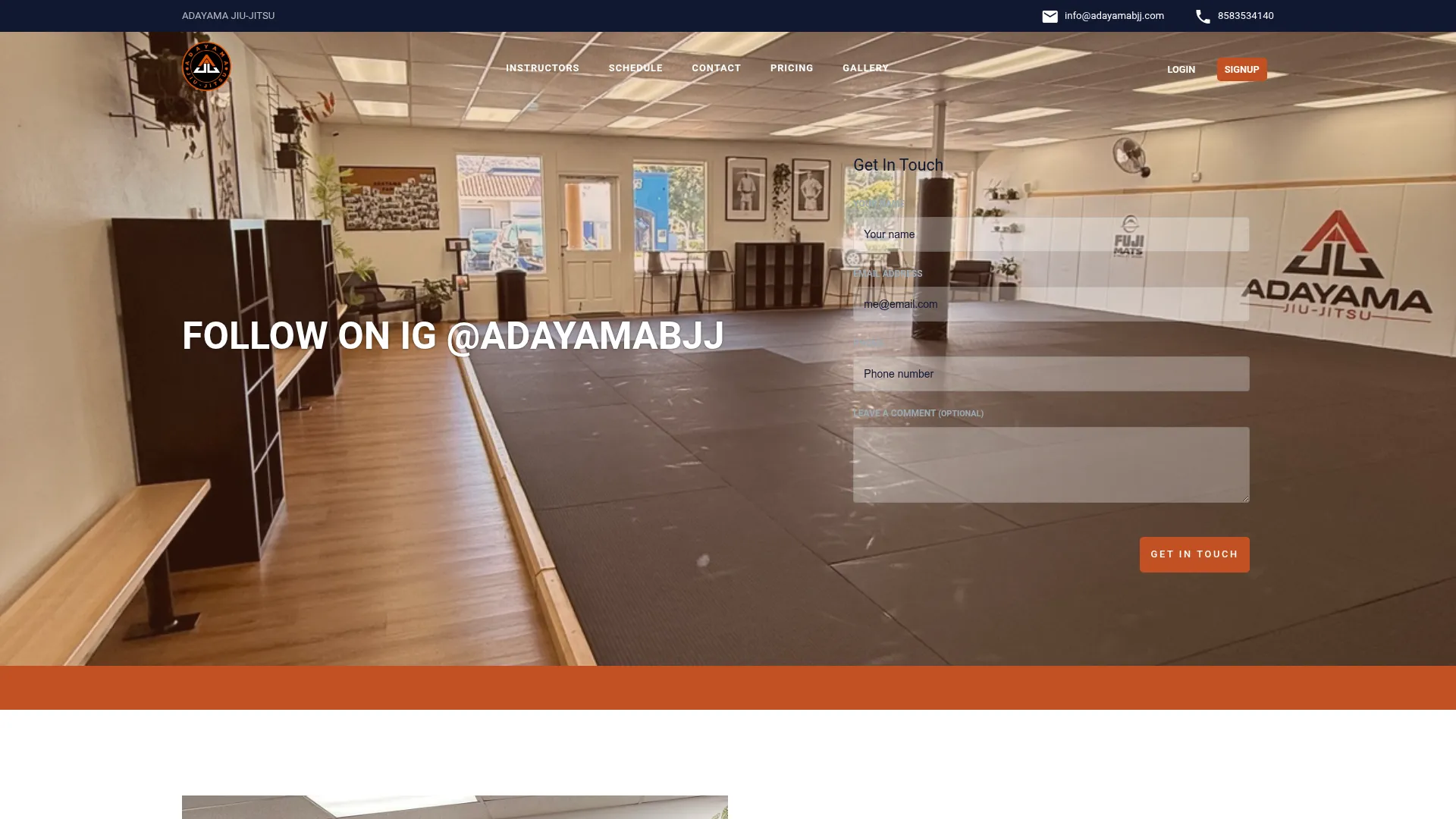
What works: A real gym-floor photo as hero—mat layout, banners, Adayama logo on the wall, unmistakably their actual room. Top nav exposes Schedule, Pricing, and Gallery as primary destinations.
A "Get In Touch" lead form is rendered directly over the hero image, above the fold without scroll. A five-star Google review block sits further down the homepage.
What to steal: Treat the homepage hero as a literal photo of the room visitors walk into—and float a name/email/phone form on top of it so lead capture happens at the same moment as the visual reassurance.
"It makes it look like you are much more omnipresent than you actually are."
— Marty Herrick, Adayama BJJ (referring to Gymdesk's marketing automation tools)
5. Grapple Zone London—London, UK
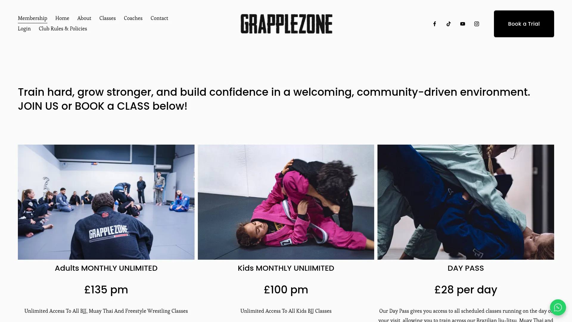
What works: The hero IS the price card. Three columns above the fold: Adults Monthly Unlimited £135, Kids Monthly Unlimited £100, Day Pass £28—each paired with a real photo of that audience training.
"Book a Trial" sits top-right. Membership is the leftmost item in the sub-nav. Squarespace front-end, Gymdesk back-end at grapplezone.gymdesk.com.
What to steal: Lead with pricing tiles, not a slogan. Removes the biggest objection (cost mystery) before the visitor has to click anywhere.
6. East Austin Jiu-Jitsu Parlor—Austin, TX
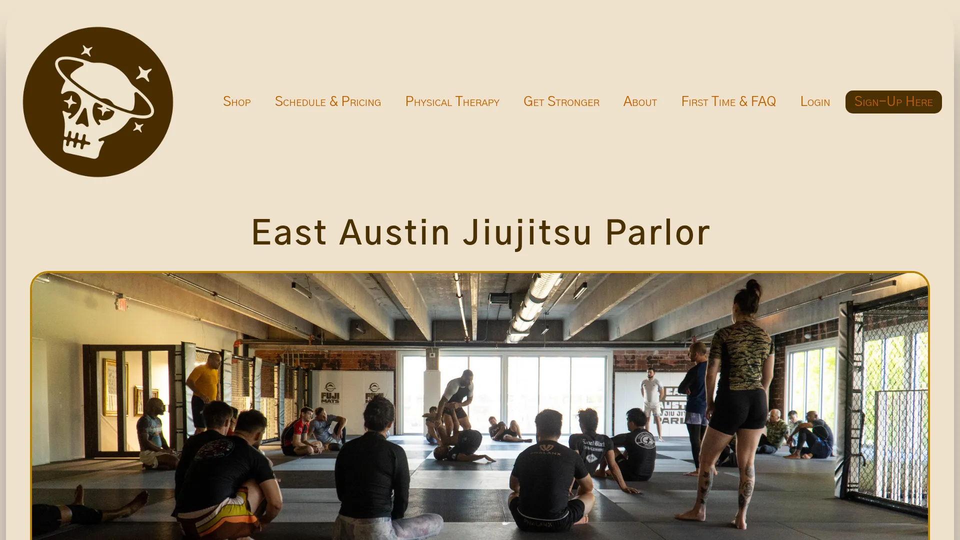
What works: A real wide-angle hero of the actual mat space mid-class with a coach demoing. "Sign-Up Here" CTA top-right. "Schedule & Pricing" is a single nav item—the two highest-friction questions merged into one click.
Pricing is fully transparent on the homepage:
- Unlimited $200/mo
- Strength & Conditioning $129/mo
- Kids $129/mo
- Open Gym $69/mo
- Cold Brew Club $20/mo and Laundry Service $40/mo (retention add-ons unique in the segment)
What to steal: Combine the two questions visitors actually ask—"when do you train?" and "what does it cost?"—into a single nav link called "Schedule & Pricing." Most sites separate them.
7. Academia BJJ—Beamsville, ON
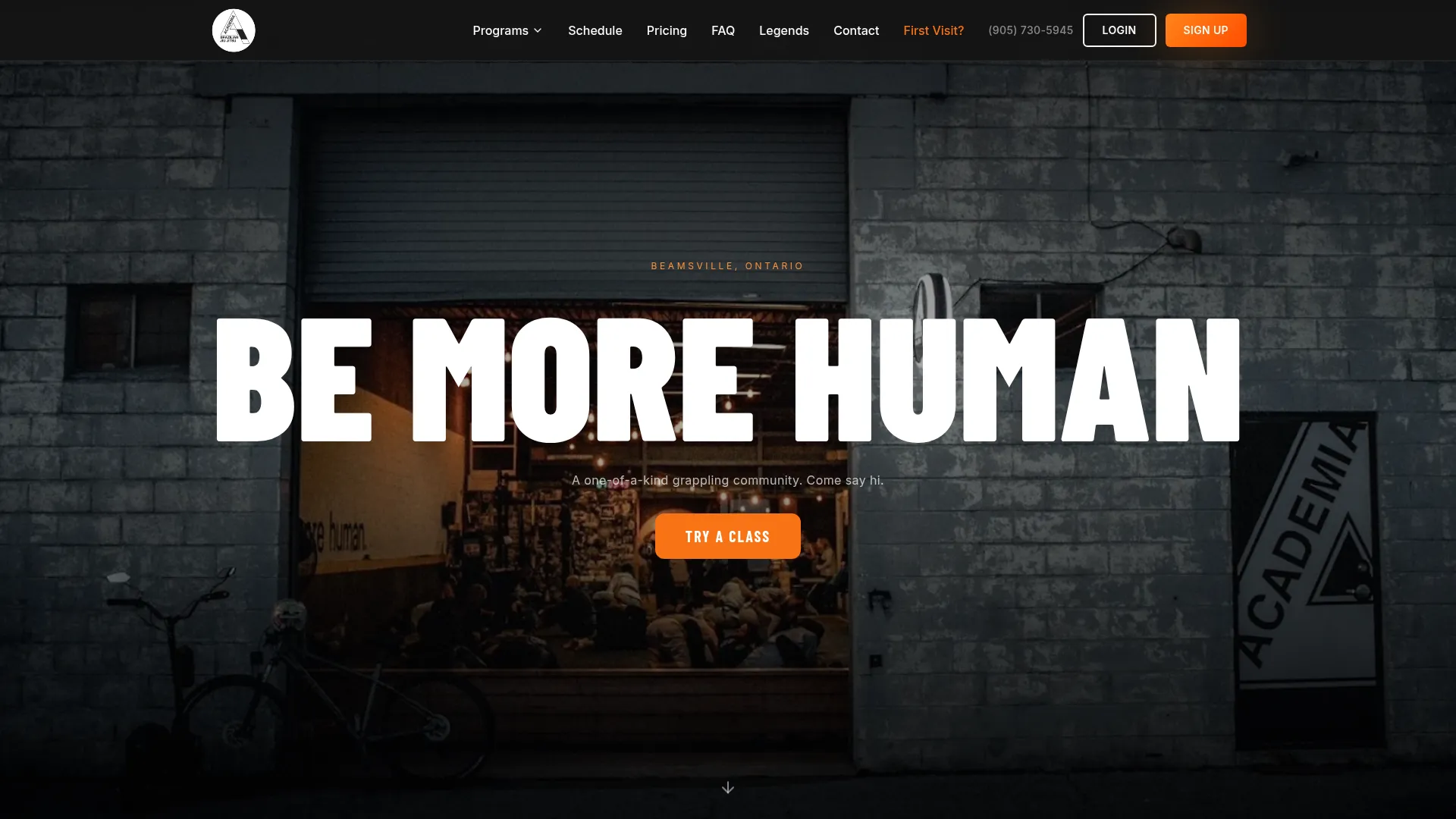
What works: A cinematic black-and-orange hero, full-bleed photo of the actual gym storefront at dusk with students visible inside, a "BE MORE HUMAN" headline in display type, and an orange "TRY A CLASS" button center-screen.
Top nav exposes Schedule, Pricing, FAQ, Legends, Contact, First Visit?, Sign Up—every conversion step is one click. A "Rated on Google" widget is present, phone number in nav. Custom build with a Gymdesk back-end at academia-brazilian-jiu-jitsu-inc.gymdesk.com.
What to steal: The "First Visit?" nav item is brilliant—it presupposes the visitor's actual mental model and removes the awkwardness of "do I qualify to come in?" Most gyms hide that flow inside FAQ.
"hope you worked hard, see you tomorrow"
— Jeff, Academia BJJ (on automated post-class follow-up emails that emulate the one-to-one experience)
Boutique fitness and strength studios (four examples)
Boutique fitness sites face a crowded market where everyone claims "expert coaching" and "community." The sites that break through make their specific community tangible.
8. Pure Barre—Multiple Locations
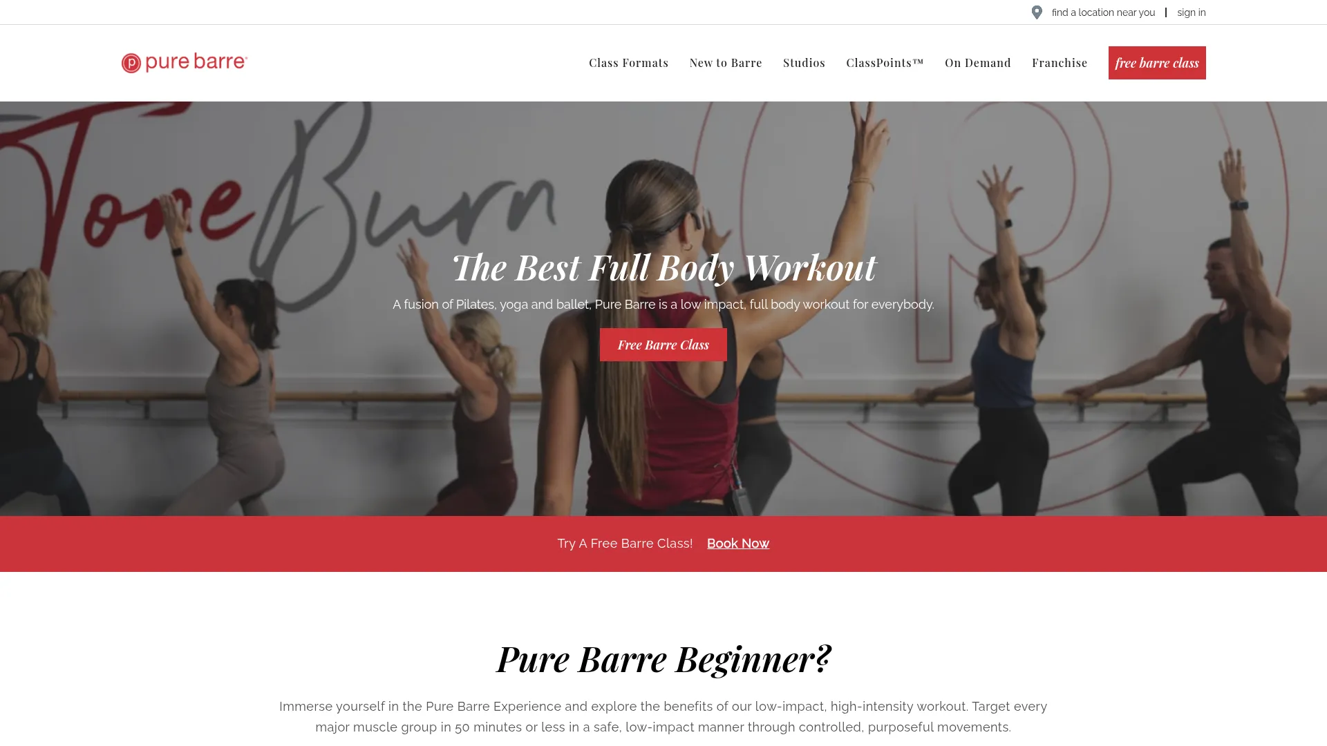
What works: A real wide-angle barre-class photo as hero with the founder's "Tone" + "Burn" hand-drawn overlay. A red "Free Barre Class" CTA sits in the upper right, repeats as a red button under the H1, and recurs as a mid-page banner. Real members in the hero (no stock). A "what our members say" testimonial section runs through the page. Studio locator + ClassPoints loyalty program tied to schedule.
What to steal: Repeating the same trial CTA in three locations on a single viewport (top-right, hero button, mid-page banner)—the visitor never has to scroll back to convert.
9. CycleBar—Multiple Locations
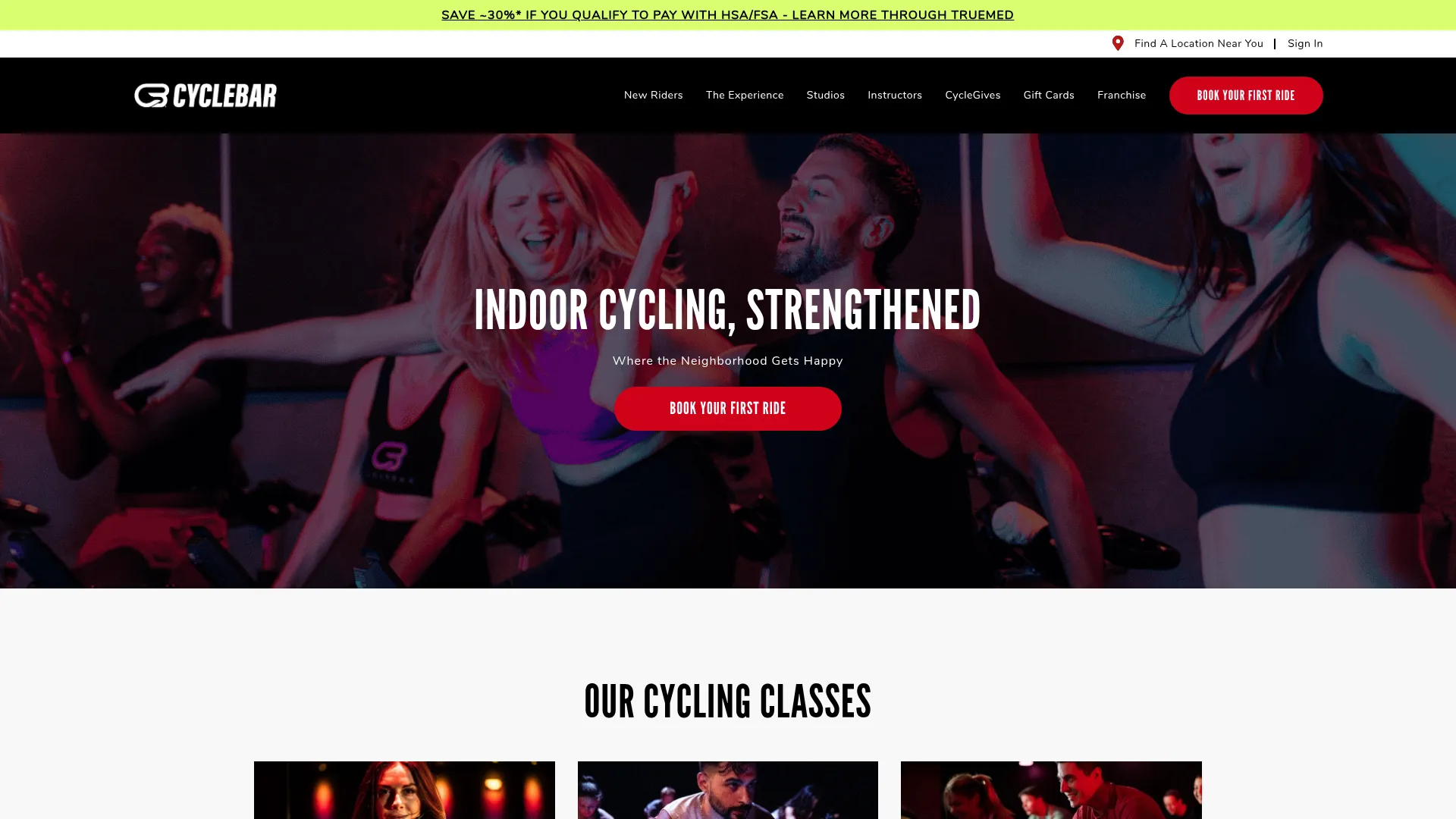
What works: Full-bleed real photo of class members on bikes mid-ride. "INDOOR CYCLING, STRENGTHENED" headline, red "BOOK YOUR FIRST RIDE" CTA persistent top-right and in hero. The top promo bar advertises "SAVE +30% IF YOU QUALIFY TO PAY WITH HSA/FSA"—a specific, qualifying offer. Real action photography, star-rating widget in body, "Find a Studio" locator above the fold.
What to steal: The HSA/FSA payment-method pop-out—a high-intent qualifier disguised as a discount. Tells the visitor the brand has thought about how to pay, not just what to pay.
10. Paragon Gym—UK
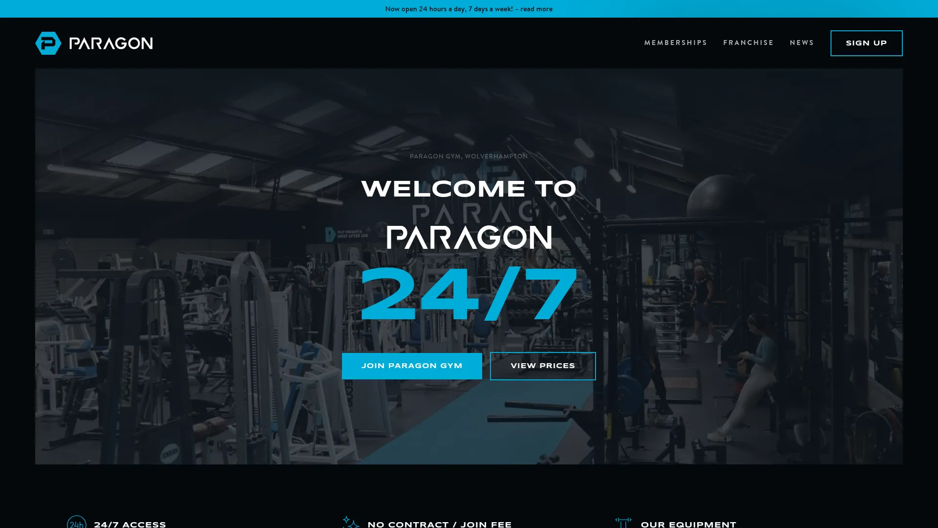
What works: A "WELCOME TO PARAGON 24/7" hero over a real interior shot with squat racks and rower visible. Two CTAs in hero: "JOIN PARAGON GYM" (primary) and "VIEW PRICES" (secondary). Pricing is one click via the "view prices" hero button—rare among gym chains. Below the fold: 24/7 access, no contract, no join fee callouts, plus real testimonials.
What to steal: Hero CTAs split by visitor intent—"Join" for ready buyers, "View Prices" for shoppers. Most gyms force shoppers through a contact form first.
11. Pharos Echo Park—Los Angeles, CA
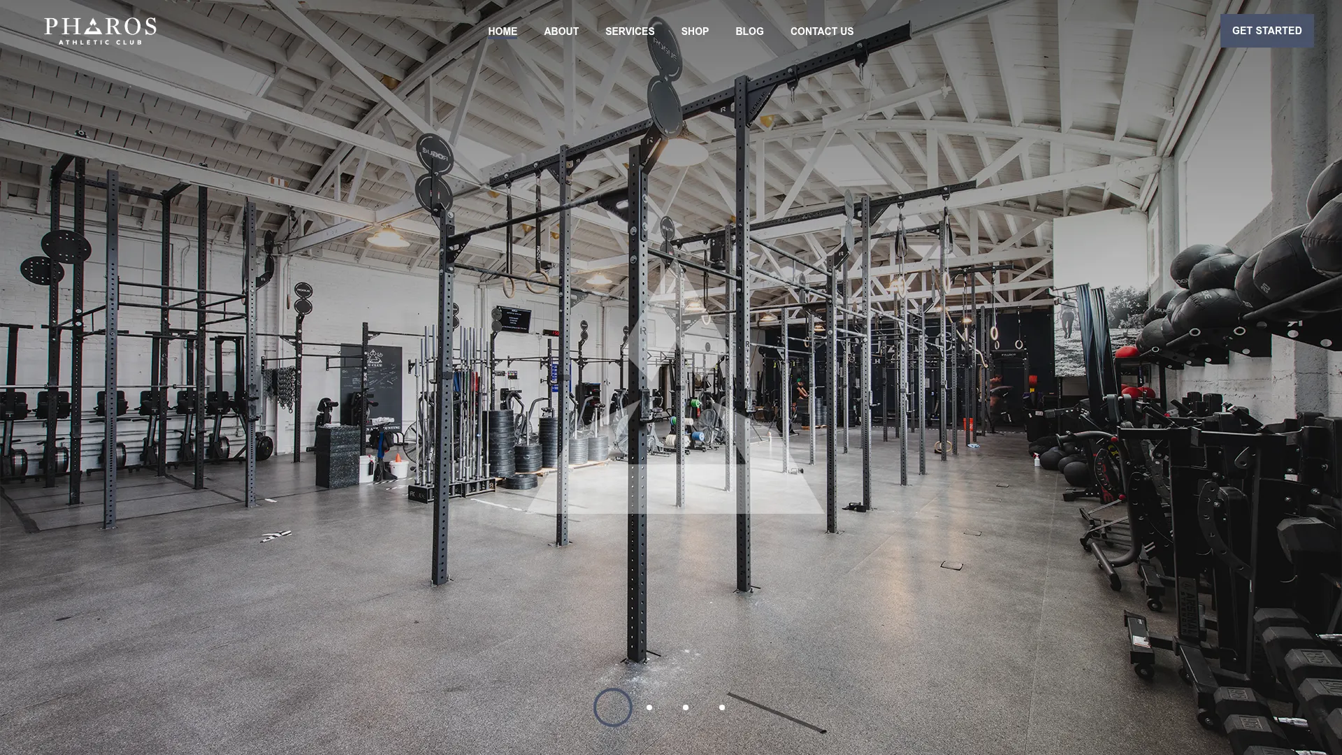
What works: A real wide-angle interior shot of the Echo Park training floor—racks, bumpers, kettlebells. "GET STARTED" CTA top-right. Below the fold, transparent intro pricing tiles: "Try your first class or open gym – $10" and "Get a 1 on 1 intro session – $45." A five-star Yelp review block is embedded.
The founders (Emylee Covell, Pieter Vodden, Katherine Haker) bring more than a decade in the fitness industry, and that origin story sits below the fold for credibility.
What to steal: A two-tier intro offer ($10 trial, $45 1:1)—lets the visitor pick the commitment level instead of forcing a single ask.
Yoga and Pilates studios (four examples)
Yoga studios and Pilates studios tend to have the most visually polished sites in fitness—and some of the worst booking flows. Beautiful design that routes to a Mindbody account wall is the anti-pattern this category needs to fix most urgently. The four below are the exceptions.
12. Yoga Kula—Toronto, ON
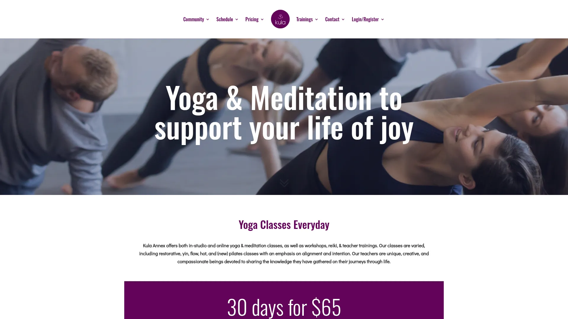
What works: A "Yoga & Meditation to support your life of joy" hero over a real classroom photo. A "30 days for $65" intro offer is prominently displayed. Schedule and Pricing both sit in main nav. The class-rates page is fully transparent.
What to steal: A clear "30 days for $65" intro offer in the hero—anchored, transparent, and turns the homepage into a conversion path.
13. Y7 Studio—NYC / LA / ATX
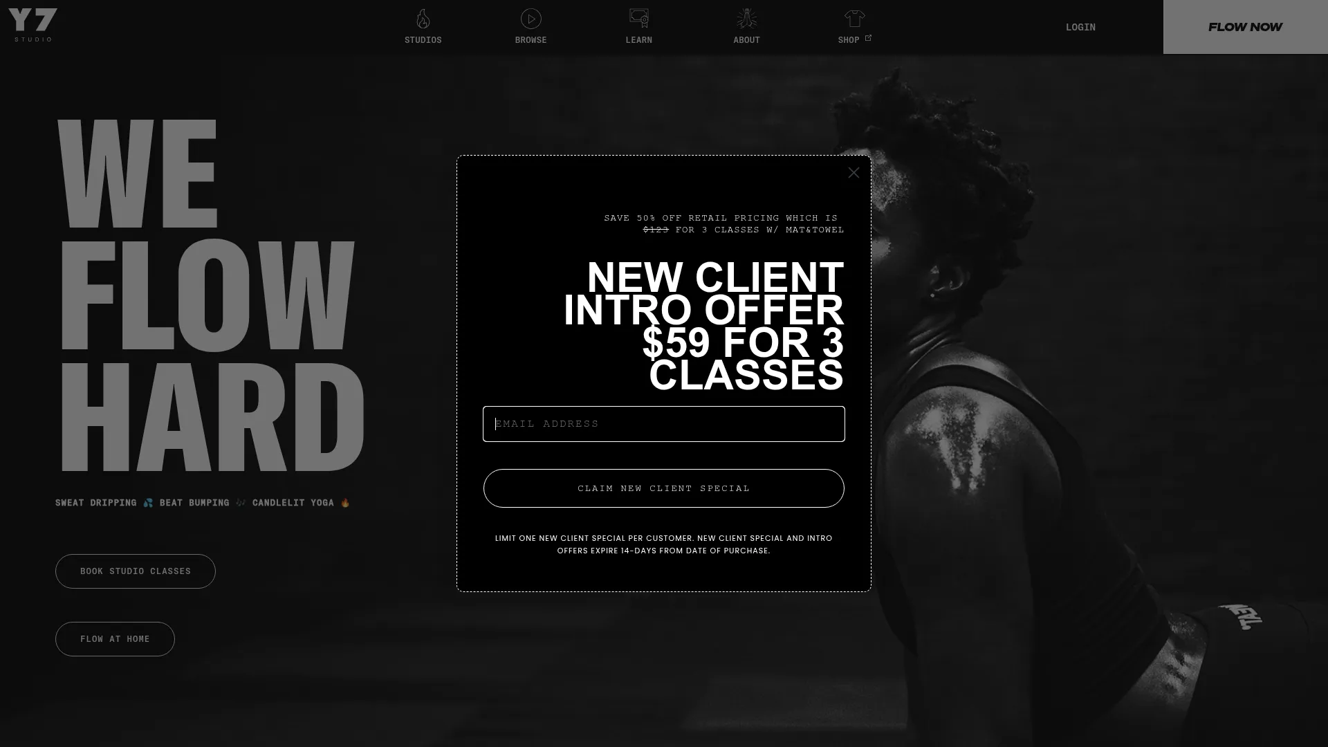
What works: A black-and-white "WE FLOW HARD" three-line display headline over a moody studio photo—but the dominant element is a centered modal with "NEW CLIENT INTRO OFFER—$59 FOR 3 CLASSES" and an email-capture form. "FLOW NOW" red CTA in nav. Per-city price points are listed transparently in the footer (NYC $14/class, LA $12/class, ATX $12/class). Schedule + studios in primary nav.
What to steal: Lead the homepage with the intro offer, not the brand statement. The brand voice and the offer coexist in the same viewport without competing.
14. Remedy Movement—Raleigh, NC
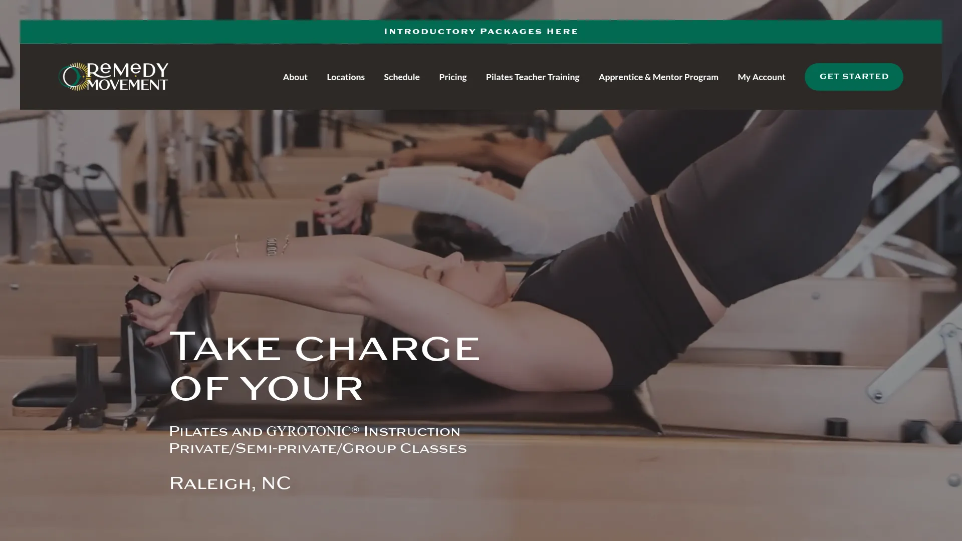
What works: Hero video footage of a reformer class, "Take charge of your" headline (completing the sentence with "LIFE" and "BODY" back and forth), dark green "GET STARTED" CTA top-right, top-bar promo "Introductory Packages here."
Transparent intro packages spelled out on the homepage: "3 Private Pilates or Gyrotonic sessions for $256" or "3 group Pilates classes for $99." Schedule, Pricing, and Pilates Teacher Training all in main nav. Long-form named-member testimonials below the fold; two-location signal in nav.
What to steal: Two-track intro pricing ($256 private vs $99 group) lets the visitor self-select by budget and intent.
15. The School of Pilates—Naperville, IL
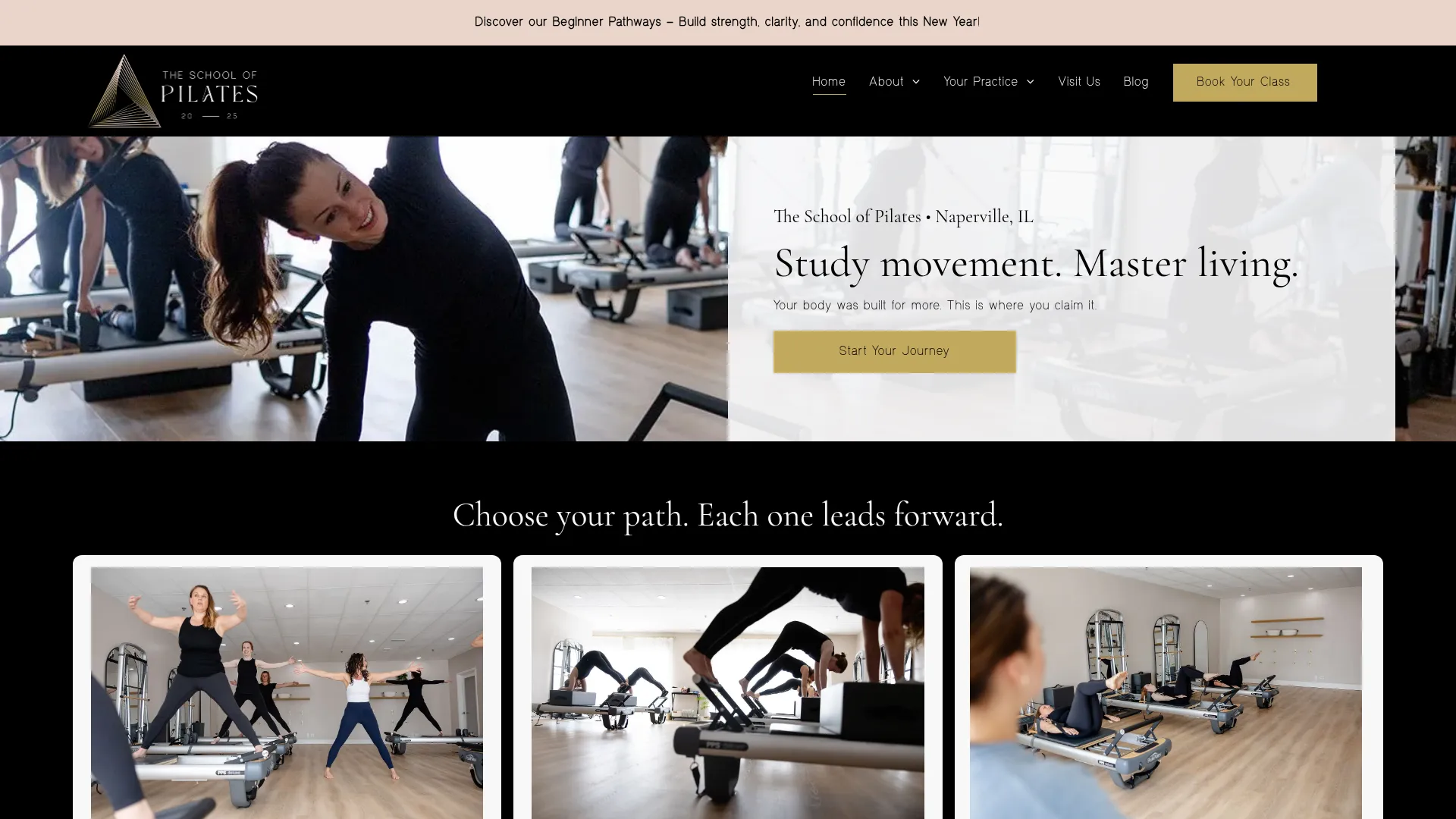
What works: Real instructor demoing reformer with class members visible in mirror reflection. "Study movement. Master living." headline; "Start Your Journey" gold CTA. Two parallel CTAs in nav: "Book Your Class" (primary, gold pill) and "Book Free Consult" (secondary, lower commitment).
"View Plans" pricing link in nav. Below the fold: a "Choose your path. Each one leads forward." three-tile path-selector (Beginner, Practice Plans, Private/Small Group). Wodify-built with booking flow at theschoolofpilates.wodify.com.
What to steal: The "Choose your path" three-tile pattern—an explicit beginner ramp on the homepage that removes the "I don't know where to start" objection before it forms.
Big-box and chain fitness (two examples)
Big-box sites are built for brand, locator, and volume—different goals than independent operators. Most underperform the 7-point checklist badly (Equinox and Life Time hide pricing entirely; Anytime and Gold's bury their differentiators). Only two big-box sites cleared 5/7 in the audit, and both are worth borrowing technique from.
16. Orangetheory Fitness—Multiple Locations
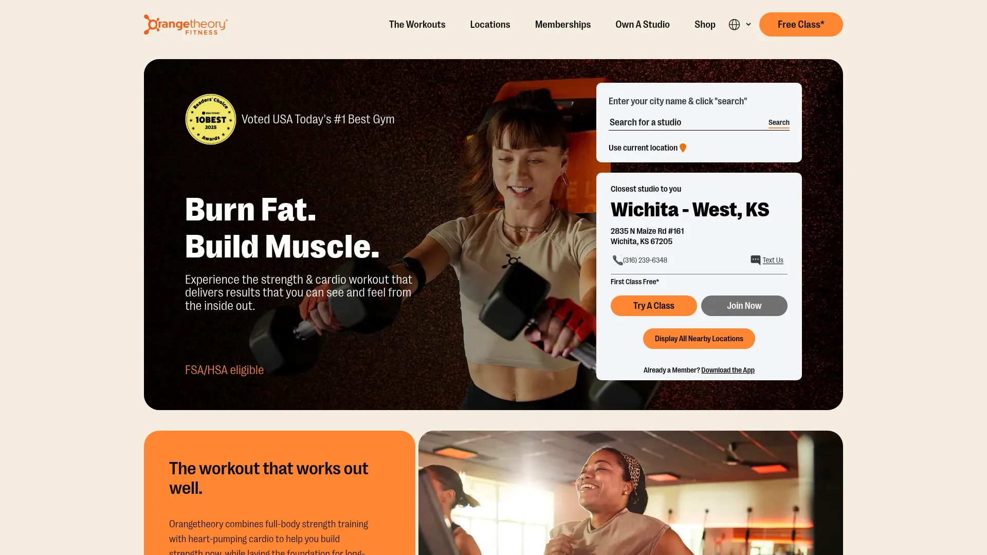
What works: Concept clarity above the fold. Orangetheory built their brand around one idea—heart rate zone training—and the site communicates it immediately.
The heart rate graphic is explained, not teased. A persistent "Free Class*" CTA sits in the upper-right, real coaching photography runs through the page, an embedded location finder doubles as a class-booking surface, and a five-star review block visible above the fold pairs with "Voted USA Today's #1 Best Gym" copy directly below.
What to steal: Lead with your concept, not your class list. If your program has a specific methodology—a structured belt curriculum, a defined training philosophy—put the concept in your hero. That's your moat. And: a locator that doubles as a booking surface—type a city, see the nearest studio, book a free class—three steps, one screen.
17. Planet Fitness—Multiple Locations
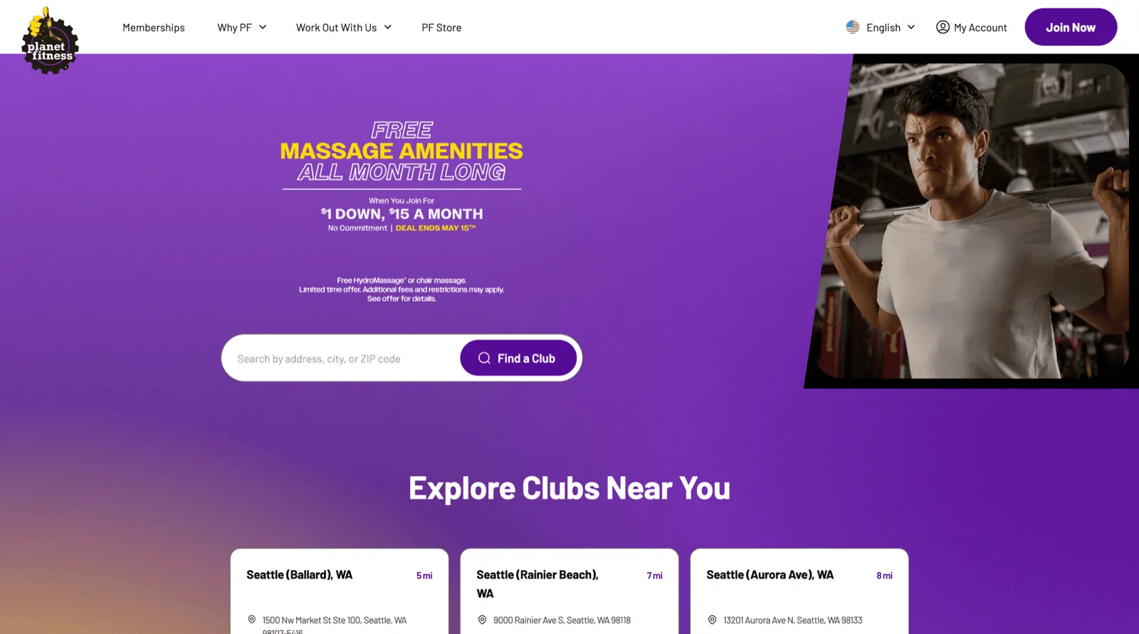
What works: The hero is an offer, not a slogan. "FREE MASSAGE AMENITIES ALL MONTH LONG / When You Join For $1 DOWN, $15 A MONTH" with a hard deadline ("DEAL ENDS MAY 15TH") sits front and center.
Right below it: a single zip-code search bar with a purple "Find a Club" button. The visitor's first decision isn't "do I trust this brand"—it's "is there one near me?"
A persistent purple "Join Now" CTA stays top-right. The page model is locator-first, offer-led, urgency-stamped. Brand positioning ("Judgement Free Zone") shows up below the fold and across product pages, but the homepage is built to convert intent into a club search.
What to steal: Combine a time-bound offer with a locator search above the fold. Most independent gyms split these into separate pages—homepage for brand, /pricing for offer, /contact for location. Planet Fitness fuses all three into the first viewport. Pre-qualified leads start with a zip code; everyone else hits "Join Now."
Four Gym Website Anti-Patterns (and How to Fix Each)
These four failure modes kill trials. None of them require a redesign to fix.
The brochure
The stock-photo mirage
The pricing hide-and-seek
The schedule dead-end
Build vs Buy: Which Website Path Is Right for Your Gym?
When DIY wins: You already have a strong brand and you're comfortable managing three or four separate tools. If you have design instincts and the patience to maintain integrations, Squarespace or Wix is fast and low cost.
When custom design wins: You have $3,000–10,000 to invest upfront and a clear design vision. Custom Webflow done well is the most visually flexible option—but your booking tool is still bolted on separately, and ongoing changes require a developer.
When all-in-one gym software wins: You want to stop integrating Calendly + Mailchimp + Stripe + Mindbody and just have one system. The website editor and booking forms are native—no API keys to rotate, no third-party tool to blame when something breaks at 6 AM. For a feature-by-feature breakdown of what to look for in management tools, see the features comparison post.
The honest trade-off: all-in-one platforms give you less design flexibility than a custom build. But for most independent gym operators, the operational overhead of running four separate tools costs more in time and stress than the design flexibility is worth.
Gym Website Conversion Audit Checklist
Most owners score between three and five out of seven on the first pass. The full 20-point audit below shows you exactly where the gaps are. Tap each element that's currently present on your homepage. Hit "Download PDF" when you're done to save your scored version.
The Bottom Line
Fix the schedule dead-end first. That single change lifts trial bookings more than any redesign.
The seven elements in this post are universal. Every one of the 17 sites above does most of them, regardless of budget, gym type, or platform.
The design choices are local. The structure is the same.
If you're starting from scratch or planning a rebuild, use the 7-point checklist as your requirements document. Every element should be present before you launch.
If you want the site, booking, and billing to talk to each other from day one—rather than stitching tools together later—the gym website builder and the all-in-one gym software overview are built for that. For the tactical how-to on building from the ground up, build a gym website is the right companion piece.
Gym management software that frees up your time and helps you grow.
Simplified billing, enrollment, student management, and marketing features that help you grow your gym or martial arts school.


FAQ
Gym Website FAQs

Sean has spent the last decade creating content that helps businesses—small and not so small—grow smarter to allow operators to do more of what they love. You know, the fun stuff.
From shipping and international logistics to web development and marketing, he's done the work (not just the words) to scale retail and service businesses efficiently.
You can find his work at Sendle, Shogun, The Retail Exec, Gymdesk, and more.