 39 Martial Arts Statistics To Know in 2022

In terms of design, tech startups and software companies seem to have consistently good websites, but websites for gyms are hit or miss. Because fitness is so important to you and your community, we want to show you what makes a good gym website and what makes a bad one.
9 Best Gym Website Examples
Let’s take a look at some I feel do a good job, and examine why.
Yoga Kula

Yoga Kula’s website is very clean and bright, giving an inviting and relaxing feel that appeals to the target audience. The high quality image in the middle of the page immediately shows what it’s like to practice yoga at this studio.
A simple Call-to-Action button in the middle, that is nicely contrasted against the background: “schedule.” This will definitely help drive more traffic to the studio itself.
Avenir Pilates

Like Yoga Kula, Avenir’s website is very simple, which will help with navigation and keeping users engaged. Information about the studio, private lessons, the schedule, and pricing are all easily accessible – textbook good design.
Avenir takes an interesting turn by adding a layer of shadow over the background to help contrast the main Call-to-Action: “Book A Class.” This subtly funnels the eye to that main button. These simple, command-style statements are very important for helping to drive the desired action, and it’s critical that you don’t place things on your website that distract from it.
TR Taekwondo

TRTKD’s website is an uncommonly good example of how to set up a martial arts gym website. The main top-level navigation is simple with only the necessary items, and it makes great use of dropdown menus for easy navigation down to important mid-level pages on the website. Among these are their many locations. The only thing they’re really missing is a current schedule; but since this is more of a corporate page, it would make more sense to keep the schedule on the location-specific pages instead.
Also, the hero section of the homepage has a well-contrasted Call-to-Action leading the user to take the next step into becoming a lead.
Life Society Gym

Life Society does an excellent job at creating a brand experience on their homepage. Classes, pricing, and contact pages are all very easily findable in the main navigation menu. A Call-to-Action that brings you to a transactional page to help you get started is placed in the hero element.
Instead of muddying up the main navigation menu with more information, they placed the gym’s contact information in an expandable “hamburger” element in the right corner for the screen.
Equinox Fitness Clubs

Equinox is a masterclass in high end lifestyle branding. It’s not possible to achieve this without a well designed website, and they have certainly succeeded at that.
The navigation bar directs you to the pages you most need to visit. Since this is a corporate website, the “clubs” menu item is first in order to funnel you to the club closest to you and thus move you closer to a membership conversion. Next, it has classes and personal training, which are often the most popular types of program at any gym. And of course, login buttons for current members are easy to find, while the “claim offer” button oriented at new prospects is highlighted to draw the eye.
Equinox also includes ample Calls-to-Action (e.g., “Join Now”), especially “above the fold” when you first land on the homepage. These help direct attention and increase conversions. And everything looks great on mobile, especially the simplicity of the main navigation.
Knockout Austin

Knockout by far has the simplest navigation. The regular menu items include the bare necessities: a page about the company, a page about the workout, a prompt to shop, and a 7 Day Challenge, which is a popular gym marketing strategy to get people moving and interested in your gym. Overall, the website is singularly geared toward capturing leads and driving sales.
In the right corner, key items are highlighted in boxes: My Account, Class Schedule, and Buy a Package. This ensures current members easily find what they are looking for. And since cardio-based boxing and kickboxing classes are a very popular and established fitness program, the “Buy a Package” button is a nice addition for people who already know what they want to do.While it seems a bit redundant with the 7 day challenge, but they’re oriented at different types of buyers.
Studio 540

Studio 540 is another very effective martial website – strong typography, high quality imagery, good contrast between elements and highly visible Call-To-Action buttons that lead visitors to give their free week a try.
This website conveys professionalism which lends itself to the brand of the school and allows them to position themselves at the higher end. The purpose of a website is to provide relevant information to potential customers, however it can also be used to position your brand and service in a certain way to justify charging more than the competition.
What Makes a Bad Website
As I was looking for inspiration for our designer when we were working on our gym website feature, I got to see many types of gym websites from different sports.
As someone who’s been in the web development industry for many years now, and has a passion for good design and user experience (even though I’m not an actual designer), it pained me to see so many websites doing their owners a disservice.
As a potential visitor / customer, when I search for a gym I’m looking to find the following information:
- What kind of training do they offer
- Who are the instructors / coaches
- When are the classes (schedule)
- Where is the gym (location)
- How can I get in touch? (Email preferred)
This is the bare minimum of information a gym website should provide. Almost all the websites I examined did present most of this information, though some skimped on some areas (such as details on the instructors, which is very important for experienced students especially).
Beyond just providing the information, how you provide it can make a big difference. Layout, aesthetics, spacing, typography, colors – all the elements that make up the design of a website contribute to visitors’ perception of it, and by extension, of your gym.
In addition, there are technical consideration:
- Does the site work well on tablets and mobile devices? (responsive design)
- Does it work on modern browsers? (you’d be surprised)
- Is the site’s structure conducive to indexing and ranking by search engines? (SEO)
I’m going to highlight a few patterns I noticed and use specific examples to explain the problems I saw there.
The Site Builder Website
Site builders are tools aimed at non-technical people, allowing them to create websites without professional help. There are some quality tools in this space, such as Wix, Squarespace and WordPress that allow people who have a basic understanding of web design and marketing to create a very effective website.
The power of a website builder is easy to misuse as well. If you don’t have a good grasp of what makes a website design work, it’s easy to create something that is less than ideal representation of your brand.
A couple of examples:

Efficient Exercise, created using WordPress, is not completely terrible, however it does not do a good job providing useful information to visitors, and the design leaves a lot to be desired. It does not look modern or high end and likely does a disservice to the business. It’s hard to believe anyone visits this website and gets excited to visit, especially when there are much better looking websites out there a click of a button away.

Perception Fitness is an even more extreme example, and seeing that it was last updated in 2013, it can almost be forgiven. However, this design was outdated in 2013 as well, and it fares even worse now.
Incredibly, despite the very basic layout and visuals, the site is also very slow – it took me over a minute to load on a 1GB Google Fiber connection. Visitors will drop off quickly off your site if it does not load within an acceptable time. Walmart found that conversion rate improves by 2% by each second less it takes their website load – and the reverse applies as well. The moral here is that don’t forget to update your website to modern standards, and make sure it runs well regardless.
The Outsourced Website:
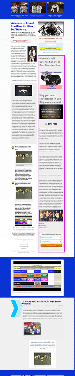
YB Taekwondo is an example of when outsourcing to an agency can also go wrong:

There is so much happening here, and without a professional, thought out design it just looks messy. No clear focus point, just a bunch of elements thrown together without much structure. The actual location looks high quality if you look at the photos closely, however the website brings down the overall impression of professionalism with its execution.
This is the main problem when outsourcing an aspect you have no understanding of – it’s hard to qualify if you’re getting quality work or not. Hopefully the examples in this article will help you avoid results like this.
The Used Car Salesman Website
A new type of website design emerged about a decade ago, dedicated to selling products and services. Often called the “long-form sales page”, those pages include all the information on the same page, along with a very aggressive sales pitch about the product / service they are offering. You have probably seen such sites, selling products such as “innovative” abs machines, and various gizmos that people buy and never use. The same format that was so pervasive on sales channels on TV once has made its way online.
Every once in a while, I run into a website that tries the same route for promoting a gym. Instead of a clean and friendly site providing the information you need, you get a very long sales pitch that rings hollow if you know anything about the sport it’s selling you on.
I’m not saying such sites can’t be effective, in a way. They are a huge turnoff, however, to the more discerning visitors. Personally, I would not feel comfortable having such a site represent my business, which in the case of martial arts, is based in large part about respect and discipline.
What Makes A Good Gym Website?
Contact and About Us Sections
It’s vitally important that a “Contact” page can be accessed from your main navigation menu. Most people who visit your website won’t sign up to your email list, but a great many will send you an email if they have a question about your gym. For that reason, make sure you have an easy-to-use contact page, with a contact form embedded on it, and visible from the main navigation bar.
Another important, but sometimes underrated, part of good gym websites is a compelling “About Us” page. While not a page that typically drives signups or inquiries on its own, it often creates the little nudge necessary to take a casual user from an onlooker to an interested lead. A good “About Us” page should tell the story of how your gym started, where it’s at now, where it’s headed, and most importantly, your culture and core values.
Quality Images and Videos
Low resolution images and videos are huge red flags to today’s internet users. It communicates an implicit lack of professionalism and credibility. And it just isn’t nice to look at.
On the flipside, high resolution images and videos create a sense of authority and quality, which causes users to perceive you and your brand as more credible. It simply looks nicer, and that really matters for keeping people on your website and generating interest in your gym.
At the very basic level, use high quality stock photos for your website. However, if possible, it’s absolutely worth hiring a professional photographer to shoot photos and videos of your gym in action. Most users can tell the difference between stock photos and real photos, and digital marketing research has shown that good quality photos of your actual facilities and people in action tend to drive higher conversion rates.
Clear Pricing and Membership Options
If you run a regular fitness gym, it’s a good idea to have your membership options easy to find and your pricing structure listed. People are used to buying gym memberships, and if you’re priced well, this should be more helpful to signing up new members than a deterrent.
For martial arts gyms, boutique fitness, and similar businesses, however, this can be different. These types of membership-based businesses must often charge a much higher per-month price. Because fewer people in the population have experienced the true value of these programs, listing $140 a month rates on your website might deter people from trying them out.
Instead, advertise the prices of your trial memberships. Keep your other programs listed and described on your website, but direct their attention toward trial pricing – whether free or at a lower cost or commitment. This should help with improving conversion from your website to membership trials, which should drive more memberships.
Schedule and Booking Options
Whether you have limited spaces, still have leftover covid regulations, or just prefer to have visitors and members book slots ahead of time, scheduling and booking capabilities are a uniquely important element on your gym website.
For starters, make sure that “schedule” is clearly accessible from your main navigation bar. From your schedule page, you can make it clear how to book a time. Sometimes this is too much hassle for non-members, so it’s okay to keep the booking function just for members, especially those who are logged into their user accounts, if you have such a feature.
Gymdesk’s built-in website feature has scheduling and booking functions ready to go out-of-the-box. It’s very easy to use for everyone: gym managers, visitors, and members.
Engaging Web Design
The inspiration for this article was the research we did when designing the template for the gym website feature we offer to users of our gym management platform. We tried to combine all the elements we felt worked best to make the gym attractive to prospective visitors, while providing all the relevant information in a clear and accessible manner. (You can see an example website here).
Hence, you will definitely find some similarities to the websites I mentioned above as they inspired our design to some degree. The basic layout is a single page site, showing all the important information in a concise manner on the homepage (introduction, instructors, schedule, location, contact information). Each section then links to a separate page with additional information.
The homepage is highlighted by a high-quality photo (we used a competition photo, as we don’t have a real gym to highlight in the background), and overall uses a bright palette with a lot of spacing.
Doing a similar technical analysis as with the previous sites, the example site linked to above weighs just a little over 400Kb and loads in 1.2 seconds on a good connection. We are able to achieve such speeds by adhering to best practices with regards to on-page optimizations, as well as running on a speedy server provided by Linode.
Like the rest of the sites mentioned above, our template is also responsive, adjusting to various screen sizes and mobile devices:

First impressions are important. Make each one count
Your gym website is the first point of contact with many of your prospective visitors and members, and it is only likely to increase in importance in the future. Make sure you don’t neglect it as it can make a big difference on your bottom line! Our gym management software will help with all of your website needs.